
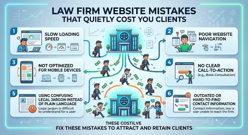
Most attorneys do not lose cases because of a single dramatic failure on their website. They lose them through small leaks that add up. A slow page here, a confusing menu there, a contact form that asks for too much. Visitors never complain. They simply leave and call someone else.
This article walks through the most common law firm website mistakes, why each one hurts, and what to do instead. Use it as a checklist before your next update or redesign.
Mistake One: Talking About the Firm Instead of the Visitor’s Problem
Many homepages open with a firm history, a mission statement, or a list of awards. A person facing a legal emergency is not looking for your origin story. They want to know if you can help with their situation.
The fix: Open with the problem you solve, the people you serve, and one clear next step. Save the credentials for right after the visitor feels understood.
Mistake Two: Hiding the Phone Number and Contact Options
If someone has to hunt for a way to reach you, many will not bother. This is especially true on phones, where frustration builds fast.
The fix: Keep a tap to call button visible at all times on mobile. Offer more than one way to connect, such as a short form, text, or a scheduled callback.
Mistake Three: Thin Practice Area Pages
A page with three generic paragraphs about “personal injury” or “divorce” gives a visitor no reason to choose you over the next result. These pages are often where search traffic lands, so they carry real weight.
The fix: Explain the legal issue in plain English, outline the process, describe realistic timelines, and answer common worries directly. Treat each page like the first ten minutes of a consultation.
Mistake Four: Slow Load Times and Poor Mobile Design
Someone searching late at night after an accident or an arrest will not wait for a heavy page to load. If your site stumbles on a cell connection, they move on.
The fix: Compress images, limit heavy scripts, and test your pages on real phones. Google also considers page experience in its ranking systems, so speed supports both conversions and visibility.
Mistake Five: Long, Intimidating Intake Forms
A form with a dozen required fields feels like paperwork. Stressed visitors abandon it.
The fix: Ask only for name, contact details, and a brief description of the issue. You can gather the rest during the first conversation. Confirm receipt right away and state when the person can expect a reply.
Mistake Six: Stock Photos and Generic Claims
Handshake photos and phrases like “aggressive representation” appear on thousands of sites. They signal nothing about your actual firm.
The fix: Use real photos of your attorneys and staff. Show specific, verifiable trust signals such as client reviews, bar admissions, and clear explanations of how fees work.
Mistake Seven: Ignoring State Bar Advertising Rules
Testimonials, case results, and claims of specialization are regulated differently in every state. A site that looks persuasive can still create compliance problems.
The fix: Review your content against the rules in each state where you are licensed, and include required disclaimers where needed.
Mistake Eight: No Plan for Accessibility
Sites that are hard to read or navigate with a keyboard or screen reader shut out potential clients and can invite legal complaints.
The fix: Use readable contrast, descriptive link text, labeled form fields, and a layout that works without a mouse.
Mistake Nine: Measuring Traffic Instead of Signed Cases
Rankings and visits feel good, but they do not pay the bills. A site can attract thousands of visitors and still produce very few clients.
The fix: Track calls, form submissions, bookings, and signed matters. Connect your intake data to your website analytics so you can see which pages and sources actually produce clients.
Where to Go From Here
You do not need to fix everything at once. Start with the changes that remove friction fastest: a visible phone button, a shorter form, and clearer messaging at the top of your homepage. Then work through your practice area pages one at a time.
If you want to see how a conversion focused approach looks when applied across an entire firm site, read more about how specialized legal web design is handled for attorneys nationwide.
Frequently Asked Questions
What is the most common law firm website mistake?
Unclear messaging is the most frequent problem. When visitors cannot tell within a few seconds whether you handle their issue, they leave, no matter how polished the design looks.
How do I know if my website is losing me clients?
Look at your analytics for high bounce rates on practice area pages, low form completion, and few calls compared to your traffic. Also test the site yourself on a phone, as a stranger would.
Can a slow website really affect my case volume?
Yes. Visitors in urgent situations have little patience. Even a delay of a few seconds can push them back to the search results, where a competitor is one tap away.
How many fields should a contact form have?
Fewer is better. Three to four fields is a good starting point: name, phone or email, and a short message. You can collect details later in a conversation.
Do I need separate pages for each practice area and location?
In most cases, yes. Dedicated pages let you speak directly to a specific issue and city, which helps both visitors and search engines understand what you offer.
How often should I audit my law firm website?
A quick review every quarter and a deeper audit once a year works well for most firms. Check speed, mobile usability, broken links, form performance, and compliance with current bar rules.